Tonight I stumbled across Sportradar.us, which seems to be the former SportsData. Interestingly, they have APIs to deliver all sorts of sports information, including comprehensive NCAA men's basketball coverage -- including play-by-play data and even location data, i.e., where on the court a shot was taken (!).
The bad news is that the lowest pricing tier is $500/month. So not something I'll be buying for Christmas. But interesting.
Wednesday, December 9, 2015
Working Overtime
 Overtime is one of the interesting quirks of basketball. In some sports -- particularly low-scoring sports like soccer and hockey -- a game may end in a tie. But in college basketball teams play additional periods -- as many as needed -- until a winner is determined.
Overtime games skew team statistics. ESPN and other sites typically have pages of statistics such as "Points Per Game". But if one game is 40 minutes long and another is 226 minutes long, it's not really an apples-to-apples comparison. This is one reason analysts are fond of "per possession" statistics -- not only does it correct for pace of play, but it also corrects for overtime games.
Clearly the statistics you feed into a predictor need to be corrected somehow for overtime games. But there's another interesting overtime issue to consider: What's the final score of an overtime game?
One choice is to use the score at the end of the overtime(s). The other is to treat the game as a tie. There are intuitive arguments in favor of both choices. The fact that Syracuse beat Connecticut suggests that Syracuse is a better team, regardless of how many minutes that took, so we should treat the game as a win for Syracuse. On the other hand, the teams were deadlocked for six overtimes, which suggests that they're about as equal as it is possible to be, regardless of whether one team or the other managed to win the game in the wee hours of the morning.
Or maybe the game should be treated as a tie for some statistics and not for others.
As longtime readers of this blog are aware, I'm a believer in doing whatever works best. So in this case, I made two runs of my predictor, once treating overtime games as ties and once using the actual final scores. In my case, the predictor performed better treating overtime games as ties.
Another possibility is to treat the final score of an overtime game as 1 or -1 (or 0.1 and -0.1 if your predictor can handle that), depending upon which team wins the overtime period(s). This retains the won/loss information, but otherwise treats the game as (nearly) a tie.
For those of you who also have predictors, I encourage you to try the same experiment and report back which choice (if either) works better for you.
Sunday, December 6, 2015
A Few Funny Things
When I logged in to work on this post, I noticed that my blog had 100,000 page views. Since I have an audience of like six people, you guys must be checking my pages a lot. Good job! Anyway, I've been spending some time lately getting my data scraping working, and that always involves a few trips through the bowels of data validation.
First stop is this game. I was running the predictor when it warned me about an unusual event: a conference game in early November. Unusual, but it happens (often a Big5 game). What was more surprising was that it was a team playing itself. According to the predictor, UNC Greensboro had come up with the clever notion of scheduling a home game against itself. Or maybe it was on the road.
One of the challenges of predicting NCAA basketball is that every data source uses different names for teams. To try to match them up I have lists of alternate team names:
In this case the predictor too aggressively (although reasonably) determined that Div III Greensboro College was a nickname for UNC Greensboro. (By the way, my list of nicknames and the Python code that goes with it is available for the asking. But you're on your own dealing with Greensboro vs. Greensboro.)
Next up is this game. Looks like a perfectly reasonable WAC Conference game. Problem is, one of those teams was not in the WAC. Actually, one of those teams didn't even exist.
You see, last year the University of Texas decided to merge two campuses -- the University of Texas Brownville and the University of Texas Pan American -- to form a brand new campus the University of Texas Rio Grande Valley. Brownsville didn't have sports, but UT-PA was a Division I team in the WAC, so the new campus stayed in the WAC and became the "Vaqueros."
(Trivia Question: Name the other four NCAA Division I basketball nicknames that are Spanish words.)
Well, ESPN decided the easiest way to deal with this whole business was to just go into their database and replace every instance of "University of Texas Pan American Broncs" with "UTRGV Vaqueros." Hence the mysterious 2013 game involving a university that wouldn't exist for several more years.
First stop is this game. I was running the predictor when it warned me about an unusual event: a conference game in early November. Unusual, but it happens (often a Big5 game). What was more surprising was that it was a team playing itself. According to the predictor, UNC Greensboro had come up with the clever notion of scheduling a home game against itself. Or maybe it was on the road.
One of the challenges of predicting NCAA basketball is that every data source uses different names for teams. To try to match them up I have lists of alternate team names:
St. Francis (NY)(That weird-looking "1383" is the name for St. Francis (NY) in the Kaggle contest. Because it's run by data scientists, so why use a human-readable name when you can use an arbitrary and completely useless number?)
1383
St. Francis BRK
St. Francis (N.Y.)
St. Francis-NY
St Francis NY
St Francis(NY)
St Francis (NY)
St. Francis Brooklyn
St. Francis NY
St. Francis-NY Terriers
St Francis (BKN)
st.-francis-(NY)-terriers
St. Francis (BKN)
In this case the predictor too aggressively (although reasonably) determined that Div III Greensboro College was a nickname for UNC Greensboro. (By the way, my list of nicknames and the Python code that goes with it is available for the asking. But you're on your own dealing with Greensboro vs. Greensboro.)
Next up is this game. Looks like a perfectly reasonable WAC Conference game. Problem is, one of those teams was not in the WAC. Actually, one of those teams didn't even exist.
You see, last year the University of Texas decided to merge two campuses -- the University of Texas Brownville and the University of Texas Pan American -- to form a brand new campus the University of Texas Rio Grande Valley. Brownsville didn't have sports, but UT-PA was a Division I team in the WAC, so the new campus stayed in the WAC and became the "Vaqueros."
(Trivia Question: Name the other four NCAA Division I basketball nicknames that are Spanish words.)
Well, ESPN decided the easiest way to deal with this whole business was to just go into their database and replace every instance of "University of Texas Pan American Broncs" with "UTRGV Vaqueros." Hence the mysterious 2013 game involving a university that wouldn't exist for several more years.
Wednesday, November 18, 2015
Why I Hate Rainbows
The University of Hawaii Rainbow Warriors play their home games at a five hour offset from the East Coast. I don't begrudge them living in Paradise, but the peculiarity of the time zones means that ESPN often reports their games as happening the day after they were actually scheduled.
This annoyance I don't need.
This annoyance I don't need.
Tuesday, November 17, 2015
Kind of Amazing
That's an animation of NBA movement data, which apparently you can get via a free API. Savvas Tjortjoglou goes into detail here. Who knows what sort of predictive model you could build exploiting this data. Thankfully the NCAA doesn't have anything of the sort, or I'd have to quit my day job.
Saturday, November 14, 2015
Really, ESPN?
With the first day's games done I fired up my ESPN score scraper to gather up the data and get the season started.
It crashed.
It seems like ESPN chose the first day of the season to roll out a new format (and URL scheme) for their basketball scoreboard page.
To be fair, I wrote my current (Python Scrapy-based) scraper with the help of Brandon Harris (*) and he warned me when I started down this road that ESPN was busy mucking up all their scoreboard pages. "Oh no," said I, "it looks fine, I'm sure they won't change it at the last second." So I have no one to blame but myself.
(*) And by help I mean he basically gave me working code.
ESPN went all Web 3.0 in their page redesign, which means that rather than send a web page, they send a bunch of Javascript and raw data and make your web browser build the page. (Which probably saves them millions of dollars a year in server costs, so who can blame them?) This breaks the whole scraper paradigm, which is to Xpath through the HTML to find the bits you need. There's no HTML left to parse. The good news in this case is that ESPN was nice enough to include the entire URL I need in the data portion of the new format, so it is very easy to do a regular expression search and pull out the good parts. Otherwise you get into some kludgy solutions like using a headless web browser to execute the Javascript and build the actual HTML page. Or trying to find the mobile version of the page and hope that's more parseable.
I don't do anything much with the model until after a few weeks of games, so I have some time to fix my code. And I suppose that if you want to scrape data from the Web, you'd better be prepared to deal with change.
Friday, November 13, 2015
Improving Early Season Performance
(I hope you're enjoying the first evening of college basketball!)
In my previous posting, I looked at the performance of my predictor on a week-by-week basis throughout the season. This showed that performance was poor at the beginning of the season (when our knowledge about teams is most uncertain) and improved throughout the season (at least until play shifts to tournaments). Is there any way we can use this insight to improve performance?
One approach is to let the model try to correct for the week to week differences. To do this, the model needs to know the week of the season for each game. But it isn't sufficient to simply have a feature with the week value (e.g., WEEK_OF_SEASON=22) because most models (and linear regression in particular) will treat that feature as a continuous value and be unable to apply a specific correction for a specific week. The solution to this is to use "one hot encoding".
One hot encoding is applicable to any sort of categorical feature -- a feature with distinct values that represent different categories, such as week in the season, day of the week, etc. One hot encoding splits the categorical feature up into a number of new features, one for each possible value of the categorical feature. For example, DAY_OF_THE_WEEK would get split into 7 new features. For each example in our data set, the appropriate feature is set to 1 while all the other features are set to 0. For a game that took place on Tuesday, the new feature DAY_OF_THE_WEEK_2 would get set to 1 (assuming Sunday is Day Zero), and DAY_OF_THE_WEEK_0, DAY_OF_THE_WEEK_1, etc. would get set to 0.
Once we've hot encoded the WEEK_OF_SEASON the model can correct on a week-by-week basis. However, whatever correction the model applies will apply to every game that week, so this approach is only suitable to correct any overall bias for that week. If the error in the week is completely random, this approach won't help.
So is there a weekly bias (at least in my model)?
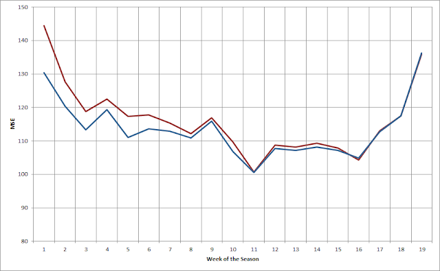
The following chart shows the Absolute Error for my model each week both before (red) and after (blue) applying this technique.

As you can see, in many weeks before applying the correction there's significant bias. Afterwards the bias is reduced to near zero. That's not surprising -- essentially what a linear regressor will do in this situation is set the new feature to be worth the negative of the mean bias, thus it will exactly cancel the bias.
Adding the hot-encoded WEEK_OF_SEASON eliminates weekly bias, but it doesn't eliminate more complex errors. A potentially better approach to reducing early season error is to add more reliable information about the strength of teams in the early season. But until teams play some games, how can we know how good they are? An obvious approach is to guess that they're about as good as they were the previous season. This isn't a perfect proxy -- after all, teams do get better or worse from season to season -- but there is a strong correlation between seasons, so it's generally a pretty good guess.
But there's a problem with just throwing data from the previous season into our model. We really only want the model to use the old data until the new data is better than the old data. It's fairly straightforward to figure out when that happens -- we run the model once on the old data and once on the new data, and look for where the new data starts to outperform the old data. But what's not easy is to stop using the old data in the model. You can't change the number of features in your training data halfway through building a model!
There are several ways you might address this problem. You could have two models, one that uses the old data up to the crossover point, and another only uses the new data after that point. You could use a weighted moving average, and start the year with the old data and gradually replace it with the new data. Or you could have both the old data and the new data in the model, but replace the old data with the new data once you hit the crossing point.
I've tried all of these approaches. Having two models is very cumbersome and creates a lot of workflow problems. The second is the most intellectually appealing, but I've never been able to get it to perform well. The third approach is simple and flexible, but has the drawback that after the crossing point the new data is in the model twice. Despite that drawback, this approach has worked the best for me.
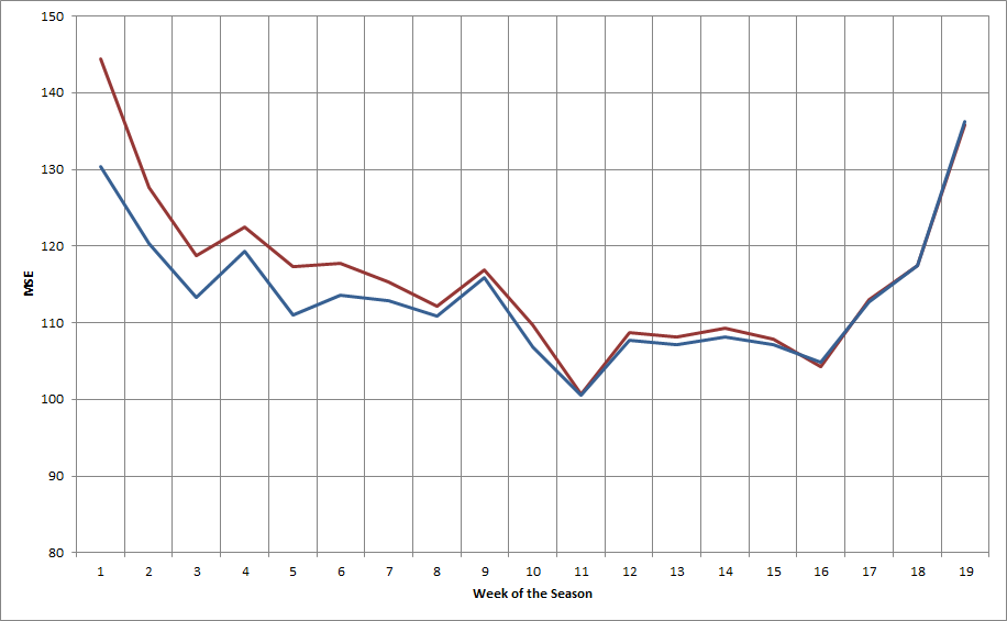
The plot below shows the mean squared error for the model both before (red) and after (blue) adding in data from the previous season.
As you would expect, this shows the most improvement early in the season -- quite dramatically in the first few weeks -- and tapers off after that. In this case, the cutoff is in the 12th week of the season. After that the impact of the old data is eliminated.
It's also interesting to look at how the old data impacts performance against the spread:

(In this graph, bigger is better.) In this case, the addition of the previous season's data helps our performance against the spread through about the first ten weeks (and nearly eliminates the anomalous performance in Week 5). Interestingly enough, this actually hurts performance slightly after Week 16.
Overall, accounting for week-by-week bias and using the previous season's data to improve early season predictions is an effective approach. It should be noted, though, that the overall improvement from these changes are modest: about 0.10 point in RMSE and less than 1% in WATS.
An interesting line of speculation is whether it is possible to easily improve the value of the previous season's data. For example, it's reasonable to expect that from year-to-year teams will tend to "regress to the mean". If that's true, regressing the previous year's data towards the mean might further improve performance.
In my previous posting, I looked at the performance of my predictor on a week-by-week basis throughout the season. This showed that performance was poor at the beginning of the season (when our knowledge about teams is most uncertain) and improved throughout the season (at least until play shifts to tournaments). Is there any way we can use this insight to improve performance?
One approach is to let the model try to correct for the week to week differences. To do this, the model needs to know the week of the season for each game. But it isn't sufficient to simply have a feature with the week value (e.g., WEEK_OF_SEASON=22) because most models (and linear regression in particular) will treat that feature as a continuous value and be unable to apply a specific correction for a specific week. The solution to this is to use "one hot encoding".
One hot encoding is applicable to any sort of categorical feature -- a feature with distinct values that represent different categories, such as week in the season, day of the week, etc. One hot encoding splits the categorical feature up into a number of new features, one for each possible value of the categorical feature. For example, DAY_OF_THE_WEEK would get split into 7 new features. For each example in our data set, the appropriate feature is set to 1 while all the other features are set to 0. For a game that took place on Tuesday, the new feature DAY_OF_THE_WEEK_2 would get set to 1 (assuming Sunday is Day Zero), and DAY_OF_THE_WEEK_0, DAY_OF_THE_WEEK_1, etc. would get set to 0.
Once we've hot encoded the WEEK_OF_SEASON the model can correct on a week-by-week basis. However, whatever correction the model applies will apply to every game that week, so this approach is only suitable to correct any overall bias for that week. If the error in the week is completely random, this approach won't help.
So is there a weekly bias (at least in my model)?
The following chart shows the Absolute Error for my model each week both before (red) and after (blue) applying this technique.

As you can see, in many weeks before applying the correction there's significant bias. Afterwards the bias is reduced to near zero. That's not surprising -- essentially what a linear regressor will do in this situation is set the new feature to be worth the negative of the mean bias, thus it will exactly cancel the bias.
Adding the hot-encoded WEEK_OF_SEASON eliminates weekly bias, but it doesn't eliminate more complex errors. A potentially better approach to reducing early season error is to add more reliable information about the strength of teams in the early season. But until teams play some games, how can we know how good they are? An obvious approach is to guess that they're about as good as they were the previous season. This isn't a perfect proxy -- after all, teams do get better or worse from season to season -- but there is a strong correlation between seasons, so it's generally a pretty good guess.
But there's a problem with just throwing data from the previous season into our model. We really only want the model to use the old data until the new data is better than the old data. It's fairly straightforward to figure out when that happens -- we run the model once on the old data and once on the new data, and look for where the new data starts to outperform the old data. But what's not easy is to stop using the old data in the model. You can't change the number of features in your training data halfway through building a model!
There are several ways you might address this problem. You could have two models, one that uses the old data up to the crossover point, and another only uses the new data after that point. You could use a weighted moving average, and start the year with the old data and gradually replace it with the new data. Or you could have both the old data and the new data in the model, but replace the old data with the new data once you hit the crossing point.
I've tried all of these approaches. Having two models is very cumbersome and creates a lot of workflow problems. The second is the most intellectually appealing, but I've never been able to get it to perform well. The third approach is simple and flexible, but has the drawback that after the crossing point the new data is in the model twice. Despite that drawback, this approach has worked the best for me.
The plot below shows the mean squared error for the model both before (red) and after (blue) adding in data from the previous season.
As you would expect, this shows the most improvement early in the season -- quite dramatically in the first few weeks -- and tapers off after that. In this case, the cutoff is in the 12th week of the season. After that the impact of the old data is eliminated.
It's also interesting to look at how the old data impacts performance against the spread:

(In this graph, bigger is better.) In this case, the addition of the previous season's data helps our performance against the spread through about the first ten weeks (and nearly eliminates the anomalous performance in Week 5). Interestingly enough, this actually hurts performance slightly after Week 16.
Overall, accounting for week-by-week bias and using the previous season's data to improve early season predictions is an effective approach. It should be noted, though, that the overall improvement from these changes are modest: about 0.10 point in RMSE and less than 1% in WATS.
An interesting line of speculation is whether it is possible to easily improve the value of the previous season's data. For example, it's reasonable to expect that from year-to-year teams will tend to "regress to the mean". If that's true, regressing the previous year's data towards the mean might further improve performance.
Friday, November 6, 2015
Performance By Week of Season
Python has some nice built-in plotting capabilities, so with a little work I was able to analyze the performance of my predictor by week of the season. This is what that looks like:
 The red dotted line is the predictor's average long-term performance. As you might expect, performance starts off very poorly but improves quite rapidly during the early part of the season. It gets to average performance after about 4 weeks, but I typically start predicting after 2 weeks (800 games), when the error is still around 12 RMSE. The more interesting observation is that prediction accuracy gets steadily worse at the end of the season. Most of the games in those last three weeks of the season are tournament games: the various conference tournaments followed by the NCAA Tournament. I assume my predictor is just worse at tournament games.
It's also interesting to look at a different measure of performance: Wins Against the Spread (ATS). This is the percentage of games where the predictor would have placed a winning bet against the Las Vegas closing line.
 (Again, the red dotted line shows the average performance.) This shows a different shape than the RMSE plot. In the late part of the season, the predictor's performance ATS gets very good -- even though its RMSE performance is getting worse. There's a similar although less obvious trend in the early part of the season, too. (I'm not sure what's going on in Week 6.) Apparently my predictor performs poorly in the late season -- but the Vegas lines perform even worse.

It's also interesting to look at a different measure of performance: Wins Against the Spread (ATS). This is the percentage of games where the predictor would have placed a winning bet against the Las Vegas closing line.

Friday, October 2, 2015
Calculating the Massey Rating, Part 3
In two previous postings, I took a look at Massey ratings and showed how to calculate the rating in Python. In this posting, we'll create a more complex version of the Massey rating and show how to calculate it.
Recall that the basic notion of the Massey rating is that the expected outcome of a game (in terms of margin of victory) is equal to the difference in ratings between the two teams:
So in some sense the rating $R$ is the "strength" of a team, and the stronger team is expected to win by about the difference in ratings between the two teams. An obvious extension of this approach is to think of teams as having not just one strength rating, but two: one for their offensive strength and one for their defensive strength. We expect a team's score to be it's offensive rating minus the defensive rating of its opponent:
There's one more wrinkle to add before we jump into modeling this rating. Since we're now looking at scores instead of margin of victory, we have to account for the home court advantage. To do this, we'll use two equations, one for the home team and one for the away team:
$$e(Score_h) = O_h - D_a + HCA$$
$$e(Score_a) = O_a - D_h$$
The home team's score is expected to be boosted by the $HCA$ while the away team is not.
Given some game outcomes, how can we calculate the team ratings? Let's start with some game data.
In [2]:
games = [[0, 3, 83, 80], [1, 4, 91, 70], [1, 5, 80, 85], [2, 0, 73, 60], [2, 3, 73, 60],
         [3, 0, 85, 60], [4, 5, 70, 78], [4, 3, 85, 70], [5, 1, 91, 70], [5, 4, 60, 68]]
Here I've invented data for ten games between six teams. Each game is represented by four elements:
$$[Team_h, Team_a, Score_h, Score_a]$$From each of these games we can generate two equations corresponding to the equations above. For example, for the first game:
$$83 = O_0 - D_3 + HCA$$$$80 = O_3 - D_0$$Altogether we'll have twenty equations. To represent each equation, we'll use a row that looks like this:
$$[O_0, O_1, O_2, ... D_0, D_1, D_2, ... HCA]$$To represent an equation, we place a 1 in the spot for the Offensive rating, a -1 in the spot for a Defensive rating, and a 1 in the HCA spot if this is the home team's score. Everything else is a zero. So the first game we get the following two rows:
$$[ 1, 0, 0, 0, 0, 0, 0, 0, 0, -1, 0, 0, 1.]$$$$[ 0, 0, 0, 1, 0, 0, -1, 0, 0, 0, 0, 0, 0.]$$Do this for all the games and we end up with a 20x13 matrix. Here's the code to create that matrix:
In [29]:
import numpy as np
def buildGamesMatrix2(games, num_teams):
    l = len(games)
    M = np.zeros([l*2, num_teams*2+1])
    for i in xrange(l):
        g = games[i]
        M[i, g[0]] += 1
        M[i, g[1]+num_teams] += -1
        M[i, num_teams*2] += 1
        M[l+i, g[1]] += 1
        M[l+i, g[0]+num_teams] += -1
    return M

M2 = buildGamesMatrix2(games,6)
print M2
The way I built this array all the home teams are first, but the order is irrelevant. The next thing we need is a corresponding array with the 20 scores. Here's the code to build that:
In [4]:
def buildOutcomes2(games, n):
    l = len(games)
    E = np.zeros([l*2])
    for i in xrange(l):
        g = games[i]
        E[i] += g[2]
        E[l+i] += g[3]
    return E

E2 = buildOutcomes2(games, 6)
print E2
Again, this looks like a row, but Python is happy to treat it as a column.
The full set of equations can be written as the matrix equation:
$$M * R = E$$The problem is to solve this equation for $R$, the vector of team ratings. Since this is a set of linear equations, we can use Numpy least squares solver to find the answer:
In [5]:
R = np.linalg.lstsq(M2,E2)[0]
print R
The vector is the team ratings. For example, Team 0's offensive rating is 29.45226244 and its defensive rating is -42.32149321. The last term is the HCA. Let's make a little pretty print function to make it easier to examine:
In [6]:
def ppResults(r, n, M, E):
    for i in xrange(n):
        print "Team[%d]: (%0.2f, %0.2f)" % (i, r[i], r[i+n])
    print "HCA: %0.2f RMSE: %0.2f MAE: %0.2f" % (r[n*2], np.mean((np.dot(M,r)-E)**2)**0.5, np.mean(np.abs(np.dot(M,r)-E)))
ppResults(R,6, M2, E2)
I've also shown a couple of error measures, based upon the difference between the actual results ($E$) and the predicted results ($M*R$). You'll also note that the defensive ratings are a little strange. Since they're negative, they're actually mean something like "the number of points this team adds to the other team's score." The math doesn't care, but if it bothers us we can adjust the scores so that the defensive ratings are all positive:
In [30]:
R = np.linalg.lstsq(M2,E2)[0]
correction = np.min(R[6:12])
R[0:12] -= correction
ppResults(R, 6, M2, E2)
(Note that we have to be careful not to "correct" the HCA term in R[12]!) Now it is more apparent that Teams 2 and 5 play very good defense, and Teams 0 and 1 not so much.
We can also solve this problem using the LinearRegression function from SciKit Learn:
In [13]:
from sklearn import linear_model
clf = linear_model.LinearRegression(fit_intercept=False)
clf.fit(M2,E2)
correction = np.min(clf.coef_[6:12])
clf.coef_[0:12] -= correction
ppResults(clf.coef_, 6, M2, E2)
This generates exactly the same answer. Which shouldn't be surprising, because under the covers the LinearRegression function calls the least squares solver. The advantage of doing it this way is that we can easily swap out the LinearRegression for a different model, for example, a Ridge regression:
In [21]:
from sklearn import linear_model
clf = linear_model.Ridge(fit_intercept=False, alpha=0.1)
clf.fit(M2,E2)
correction = np.min(clf.coef_[6:12])
clf.coef_[0:12] -= correction
ppResults(clf.coef_, 6, M2, E2)
As you can see, this returns slightly different results. You can read about Ridge regression in detail elsewhere, but the gist is that it addresses some problems in least squares regression that often occur in real-world data. It's not important in this toy example, but if you actually want to calculate this rating for NCAA teams, it can be useful.
There's yet another approach we can use to solve this problem: stochastic gradient descent (SGD). SGD is a method for finding the minimum of a function. For example, consider the following function (taken from here):
In [22]:
from scipy import optimize
import pylab as plt
%matplotlib inline
import numpy as np
def f(x):
    return x**2 + 10*np.sin(x)
x = np.arange(-10, 10, 0.1)
plt.plot(x, f(x))
plt.show()

The minimum point of this function is around -1.3. How could we figure that out? Imagine that we could place a ball bearing on the graph of this function. When we let go, it will roll downhill, back and forth, and eventually settle to the lowest point. That's essentially how SGD works. It picks a point somewhere on the graph, measures the slope at that point, steps off a bit in the "downhill" direction, and then repeats. And because this is done numerically, it works for any function. Let's try it:
In [23]:
print "Minimum found at: %0.2f" % optimize.fmin_bfgs(f, 0)[0]
That's pretty straightforward, so let's try this for our ratings. First we have to write the function that we're trying to minimize. If you think about it a moment, you'll realize that what we're trying to do is minimize the error in our ratings. That's just the term from our pretty-print function, so we can pull it out and create an objective function:
In [25]:
def objf(BH, M2, E2):
    return np.mean((np.dot(M2,BH)-E2)**2)**0.5
We also need to provide a first guess at values for BH. We'll take a simple way out and guess all ones. Then we can stick it all into the optimize function and see what happens.
In [24]:
first_guess = np.ones(13)
answer = optimize.fmin_bfgs(objf, first_guess, args=(M2, E2))
correction = np.min(answer[6:12])
answer[0:12] -= correction
ppResults(answer, 6, M2, E2)
And sure enough, it finds the same answer.
There are several drawbacks to solving our ratings this way. First of all, it can be slower (possibly much slower) than the linear least squares solution. Secondly, it can sometimes fail to find the true minimum of the function. It can get "trapped" into what is called a local minimum. Recall the graph of the example function:
In [26]:
plt.plot(x, f(x))
plt.show()
See the little valley around 4? That's a local minimum. If we happen to start in the wrong place, SGD can roll down into that minimum and get stuck there.
In [27]:
print "Minimum found at: %0.2f" % optimize.fmin_bfgs(f, 3, disp=0)[0]
Oops. There are ways to address this problem, but I won't discuss them here.
Despite these drawbacks, SGD has a couple of big advantages over linear regression. First, linear regression always optimizes over mean square error (that's the RMSE metric), and that may not be what you want. For example, The Prediction Tracker shows both mean square error and mean absolute error (that's MAE). My predictor was often better at RMSE and worse at MAE, which irked me. If it had bothered me enough, I could have used SGD to optimize on MAE instead of RMSE:
In [28]:
def ourf(BH, M2, E2):
    # Note the different return value here
    return np.mean(np.abs(np.dot(M2,BH)-E2))
first_guess = np.ones(13)
answer = optimize.fmin_bfgs(ourf, first_guess, args=(M2, E2))
correction = np.min(answer[6:12])
answer[0:12] -= correction
ppResults(answer, 6, M2, E2)
This solution has a better MAE (and a worse RMSE). In general, you can choose any objective function to optimize through SGD, so that provides a lot of flexibility.
The second advantage of SGD is that it isn't limited to linear functions. You could use it to minimize a polynomial or other complex function. That isn't directly relevant for this rating system, but it could be for a different system.
In [ ]:
Subscribe to:
Posts (Atom)